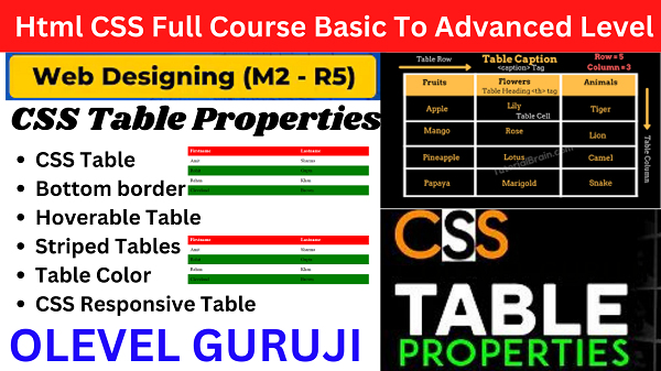
CSS Table Style
Cascading Style Sheets (CSS) play a pivotal role in shaping the visual appeal and user experience of a website. Among the myriad elements you can style, tables stand out as versatile components that can be transformed into eye-catching and functional entities. In this exploration, we dive into the art of CSS Table Styles, discovering how they can elevate your web design to new heights. If you seaching HTML CSS table property then you are on right place here we will get CSS table style with examples.
Let us see the detailed example
Example
<!DOCTYPE html>
<html>
<head>
<style>
table, td, th {
border: 1px solid #ddd;
text-align: left;
}
table {
border-collapse: collapse;
width: 100%;
}
th, td {
padding: 15px;
}
</style>
</head>
<body>
<h2>The padding Property</h2>
<p>This property adds space between the border and the content in a table.</p>
<table>
<tr>
<th>Firstname</th>
<th>Lastname</th>
<th>Savings</th>
</tr>
<tr>
<td>Amit</td>
<td>Sharma</td>
<td>100000</td>
</tr>
<tr>
<td>Rohit</td>
<td>Gupta</td>
<td>500000</td>
</tr>
<tr>
<td>Rehan</td>
<td>Khan</td>
<td>300000</td>
</tr>
<tr>
<td>Cleveland</td>
<td>Brown</td>
<td>$250</td>
</tr>
</table>
</body>
</html>
Output
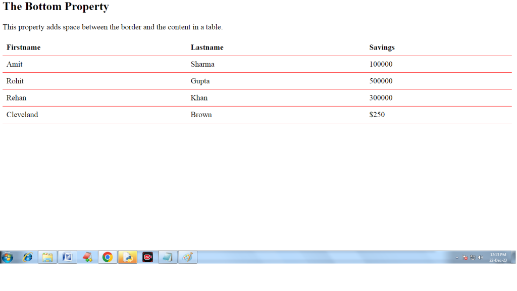
 1) Bottom Border-
This property adds border at the bottom of each row. Example
<html>
<head>
<style>
table {
border-collapse: collapse;
width: 100%;
}
th, td {
padding: 8px;
text-align: left;
border-bottom: 1px solid red;
}
</style>
</head>
<body>
<h2>The Bottom Property</h2>
<p>This property adds border at the bottom of each row.</p>
<table>
<tr>
<th>Firstname</th>
<th>Lastname</th>
<th>Savings</th>
</tr>
<tr>
<td>Amit</td>
<td>Sharma</td>
<td>100000</td>
</tr>
<tr>
<td>Rohit</td>
<td>Gupta</td>
<td>500000</td>
</tr>
<tr>
<td>Rehan</td>
<td>Khan</td>
<td>300000</td>
</tr>
<tr>
<td>Cleveland</td>
<td>Brown</td>
<td>$250</td>
</tr>
</table>
</body>
</html>
Output
2) Hoverable Table
This property is used to highlight table rows on mouse over:
Syntax-
tr:hover {background-color: red;}
3) Striped Tables
We can use zebra-striped tables with nth-child() selector and add a background-color to all even (or odd) table rows:Example
<html>
<head>
<style>
table {
border-collapse: collapse;
width: 100%;
}
th, td {
text-align: left;
padding: 8px;
}
tr:nth-child(even) {background-color:green}
</style>
</head>
<body>
<h2>Striped Table</h2>
<p>For zebra-striped tables, use the nth-child() selector and add a background-color to all even (or odd) table rows:</p>
<table>
<tr>
<th>Firstname</th>
<th>Lastname</th>
<th>Savings</th>
</tr>
<tr>
<td>Amit</td>
<td>Sharma</td>
<td>100000</td>
</tr>
<tr>
<td>Rohit</td>
<td>Gupta</td>
<td>500000</td>
</tr>
<tr>
<td>Rehan</td>
<td>Khan</td>
<td>300000</td>
</tr>
<tr>
<td>Cleveland</td>
<td>Brown</td>
<td>$250</td>
</tr>
</table>
</body>
</html>
css properties list with examples
Output

4) Table Color
By using this propert we can apply colors on table text.
Syntax- color:color-name;
Example
<html>
<head>
<style>
table {
border:1px solid black;
border-collapse: collapse;
width: 100%;
}
th, td {
text-align: left;
color: blue;
border:1px solid black;
padding: 8px;
}
th {
color: red;
}
</style>
</head>
<body>
<table>
<tr>
<th>Firstname</th>
<th>Lastname</th>
<th>Savings</th>
</tr>
<tr>
<td>Amit</td>
<td>Sharma</td>
<td>100000</td>
</tr>
<tr>
<td>Rohit</td>
<td>Gupta</td>
<td>500000</td>
</tr>
<tr>
<td>Rehan</td>
<td>Khan</td>
<td>300000</td>
</tr>
</table>
</body>
</html>
css background property with example
Output

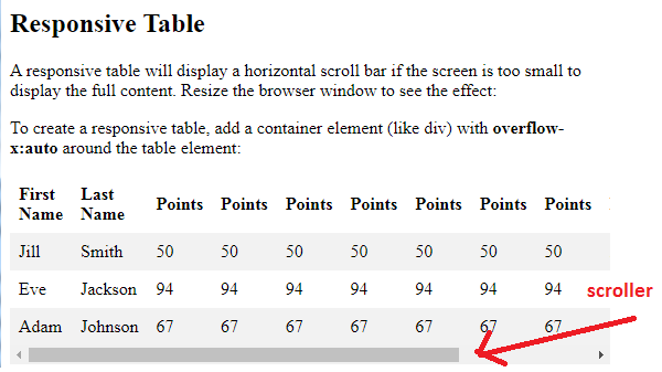
5) CSS Responsive Table
A responsive table will display a horizontal scroll bar if the screen is too small to display the full content. Resize the browser window to see the effect.To create a responsive table, add a container element (like div) with overflow-x:auto around the table element.
<html>
<head>
<style>
table {
border-collapse: collapse;
width: 100%;
}
th, td {
text-align: left;
padding: 8px;
}
tr:nth-child(even) {background-color: #f2f2f2;}
</style>
</head>
<body>
<h2>Responsive Table</h2>
<p>A responsive table will display a horizontal scroll bar if the
screen is too
small to display the full content. Resize the browser window to see
the effect:</p>
<p>To create a responsive table, add a container element (like div)
with <strong>overflow-x:auto</strong> around the table element:</p>
<div style=”overflow-x: auto;”>
<table>
<tr>
<th>First Name</th>
<th>Last Name</th>
<th>Points</th>
<th>Points</th>
<th>Points</th>
<th>Points</th>
<th>Points</th>
<th>Points</th>
<th>Points</th>
<th>Points</th>
<th>Points</th>
<th>Points</th>
</tr>
<tr>
<td>Jill</td>
<td>Smith</td>
<td>50</td>
<td>50</td>
<td>50</td>
<td>50</td>
<td>50</td>
<td>50</td>
<td>50</td>
<td>50</td>
<td>50</td>
<td>50</td>
</tr>
<tr>
<td>Eve</td>
<td>Jackson</td>
<td>94</td>
<td>94</td>
<td>94</td>
<td>94</td>
<td>94</td>
<td>94</td>
<td>94</td>
<td>94</td>
<td>94</td>
<td>94</td>
</tr>
<tr>
<td>Adam</td>
<td>Johnson</td>
<td>67</td>
<td>67</td>
<td>67</td>
<td>67</td>
<td>67</td>
<td>67</td>
<td>67</td>
<td>67</td>
<td>67</td>
<td>67</td>
</tr>
</table>
</div>
</body>
</html>
Output
I hope you will understand the topic CSS table style with examples well.
For Live class click on the link